Identity system
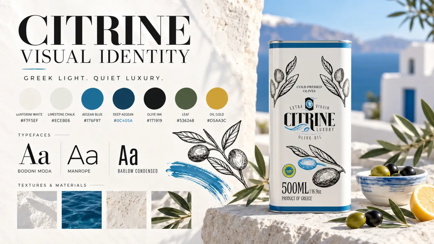
Primary, reversed, monochrome, compact and symbol treatments with clear-space logic.

Brand · Website · Product imagery
A Santorini-inspired brand and digital system that turns Greek provenance, four product formats and a personal ordering route into one coherent experience.
The brief
The range needed a coherent presentation that could carry the Greek provenance story, premium positioning and practical format choice without becoming ornate or difficult to use.
The work had to give every tin a place in one product family, establish a recognisable visual world and help a buyer move from atmosphere to product comparison and a clear ordering route.
My contribution
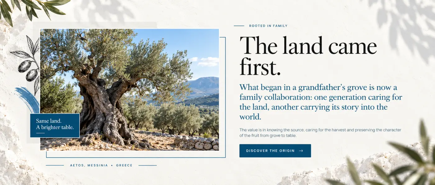
I developed the product presentation, identity direction and website structure shown in this case study.
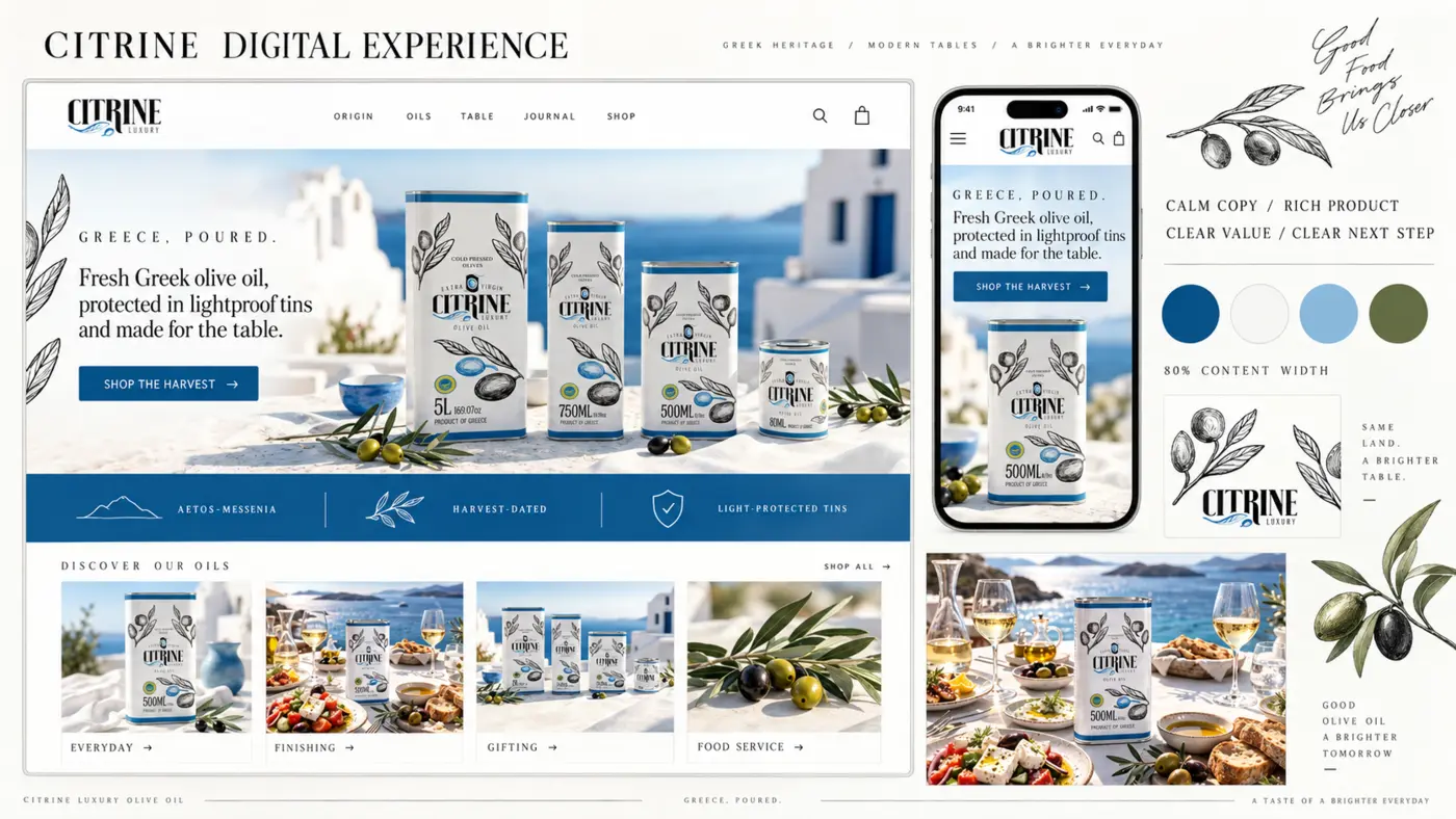
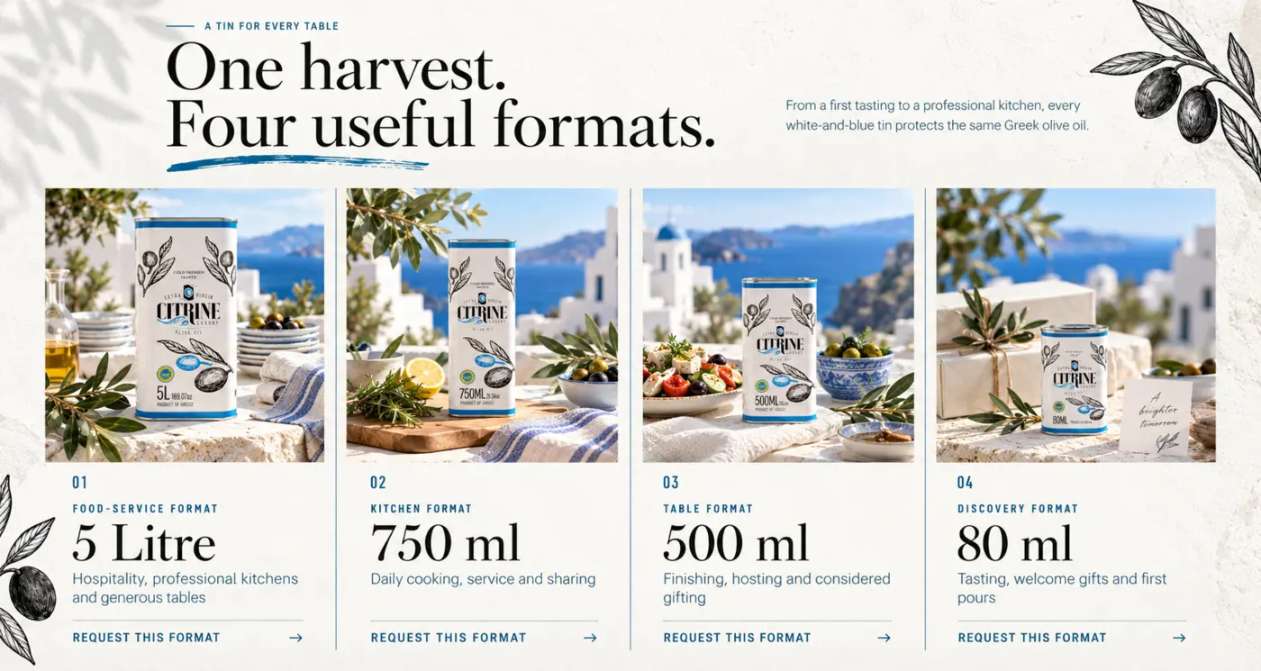
The four product formats are presented as one family, with naming and comparison helping buyers understand the choice before following the personal-order route.
Use the work shown here to assess the visual direction and reasoning. This case study describes design intentions and deliverables; it does not claim measured sales or campaign results.
The response
The system uses Santorini blue, white architecture, Mediterranean food rituals and restrained botanical illustration to make the range feel distinctive and coherent.
Large editorial headings create character while clean cards, direct product naming and repeated actions keep the website understandable. The visual atmosphere supports the product instead of obscuring it.
Selected work
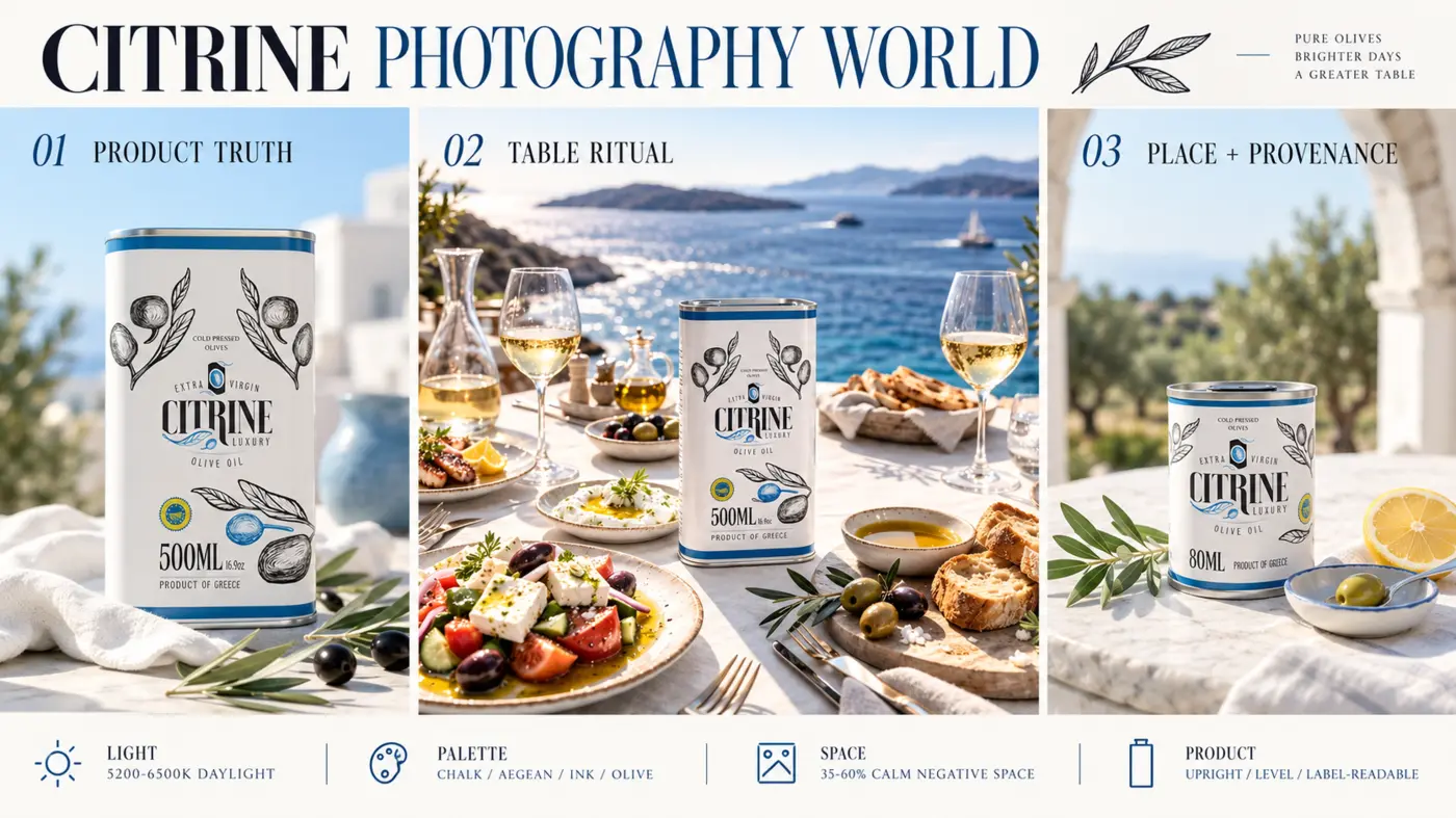
The following examples show the relationship between identity, product architecture and photographic direction.
Work shown
Primary, reversed, monochrome, compact and symbol treatments with clear-space logic.
A coherent packaging and presentation system across four useful formats.
Product truth, table ritual and Greek provenance expressed through purposeful scenes.
Responsive page direction, product comparison and a simple personal-order route.
See the complete system
The full showcase explains the logo, product architecture, photography, website, message hierarchy and buyer journey in greater depth.
Explore the Citrine Showcase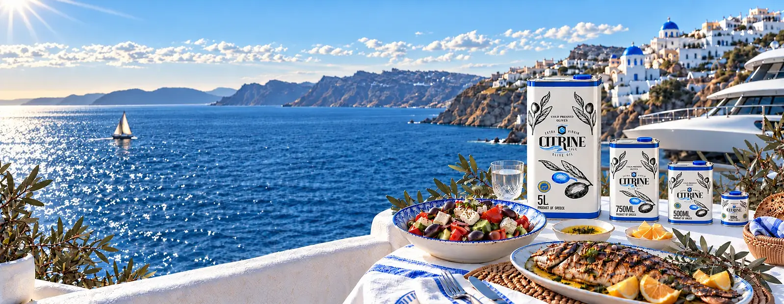
A similar challenge?
If the product is stronger than the way it currently appears, tell me what customers need to understand, compare and feel confident choosing. We will identify the most useful first step before defining the scope.
Website Design