What must remain true
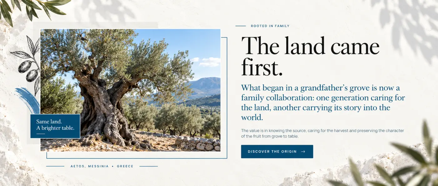
Citrine should feel connected to real olive-growing provenance, thoughtful production and the everyday pleasure of good food.

Full visual showcase · Citrine Luxury Olive Oil
Follow one central idea from Greek provenance through identity, packaging, photography, website structure and the personal ordering journey. Each expression changes with its job while the product world remains unmistakably connected.
System snapshot
The origin
The visual direction uses Santorini blue, structural white and olive-growing imagery to connect the product presentation with the provenance story described in the brief.
Citrine should feel connected to real olive-growing provenance, thoughtful production and the everyday pleasure of good food.
Generic luxury codes, ornamental excess and imagery that makes the packaging more important than the product and place.
Brand world
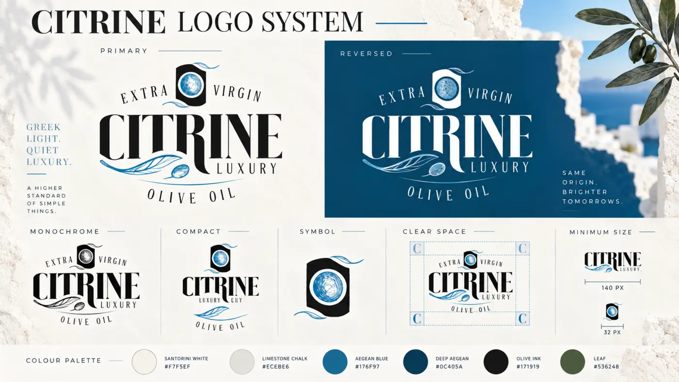
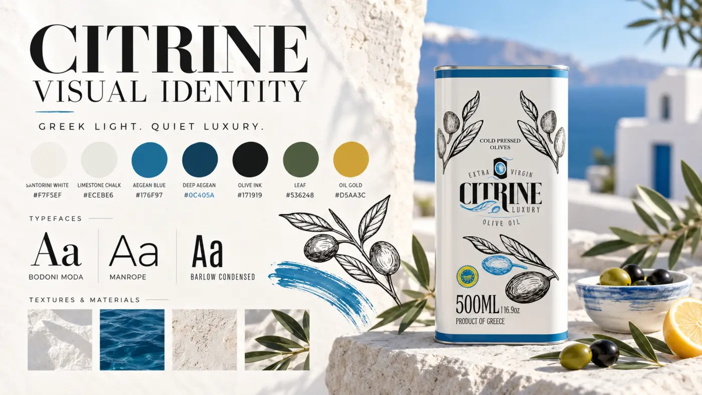
Structural white carries openness and light. Aegean blues create recognition and place. Olive green supports provenance, while illustration brings the product back to the branch and fruit.
Product family
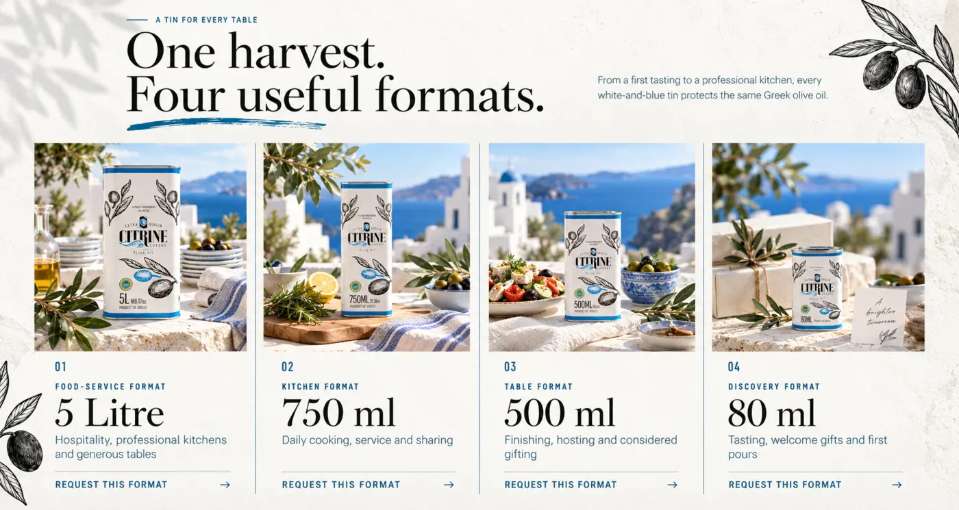
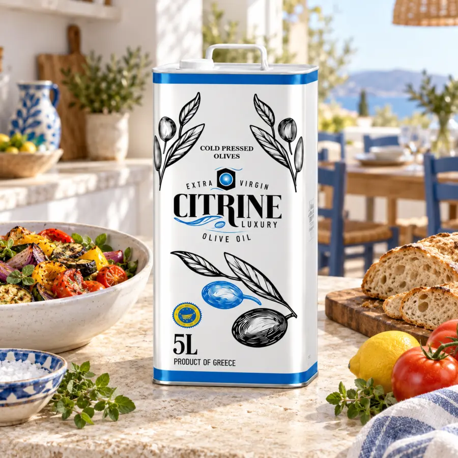
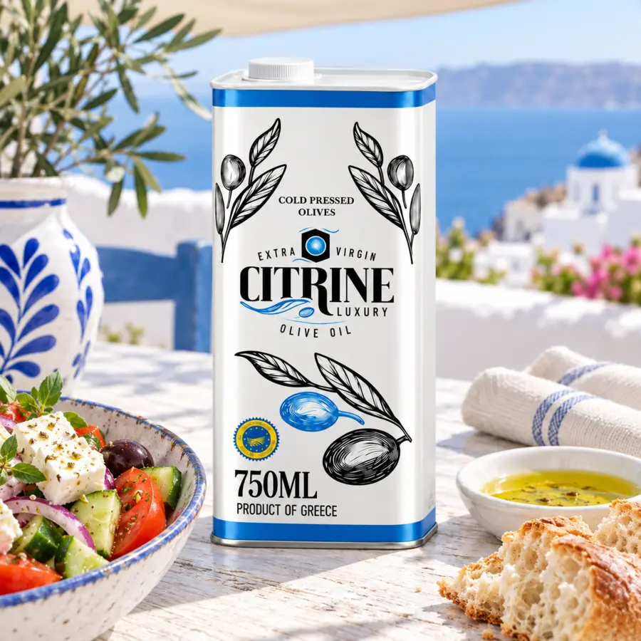
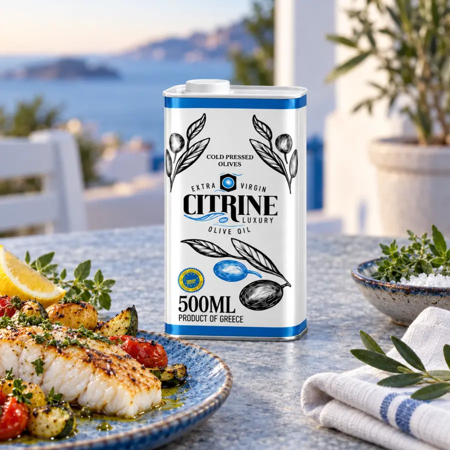
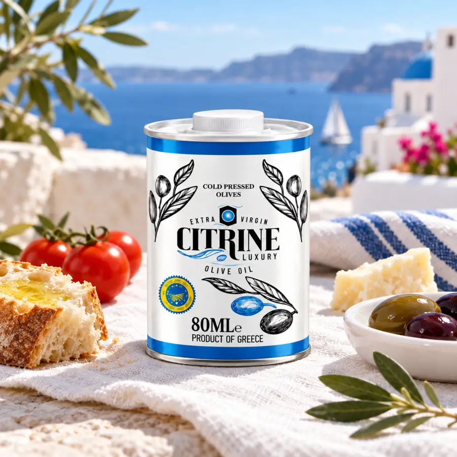
The range is structured by use rather than by arbitrary hierarchy: pantry quantity, everyday cooking, finishing and a smaller discovery or gifting format.
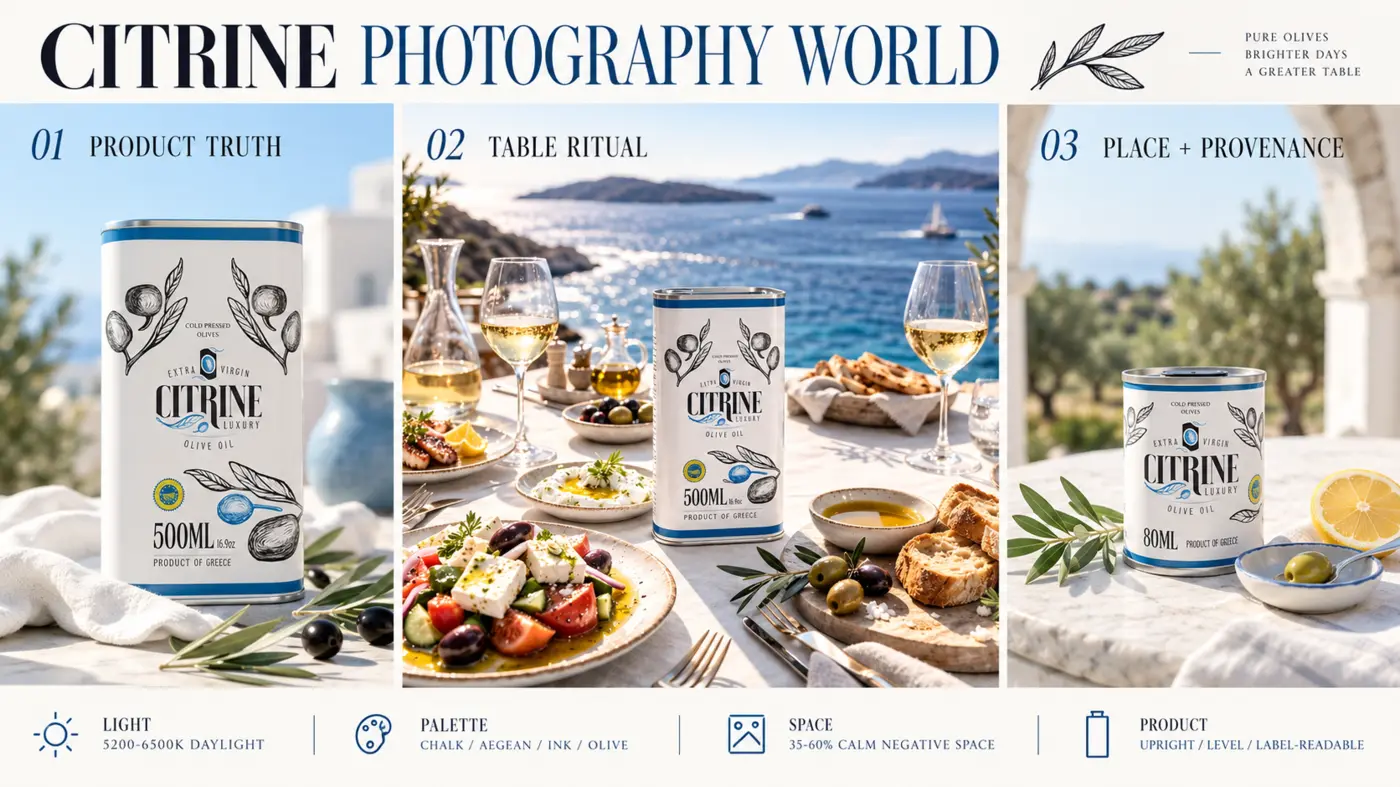
Photography world
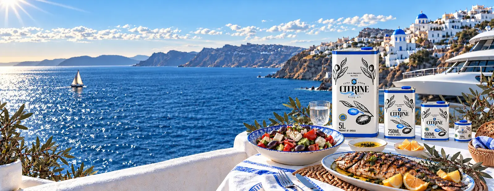
Product truth shows the tin clearly. Table ritual shows how the oil belongs in real food moments. Place and provenance reconnect the product to Greece.
Digital experience
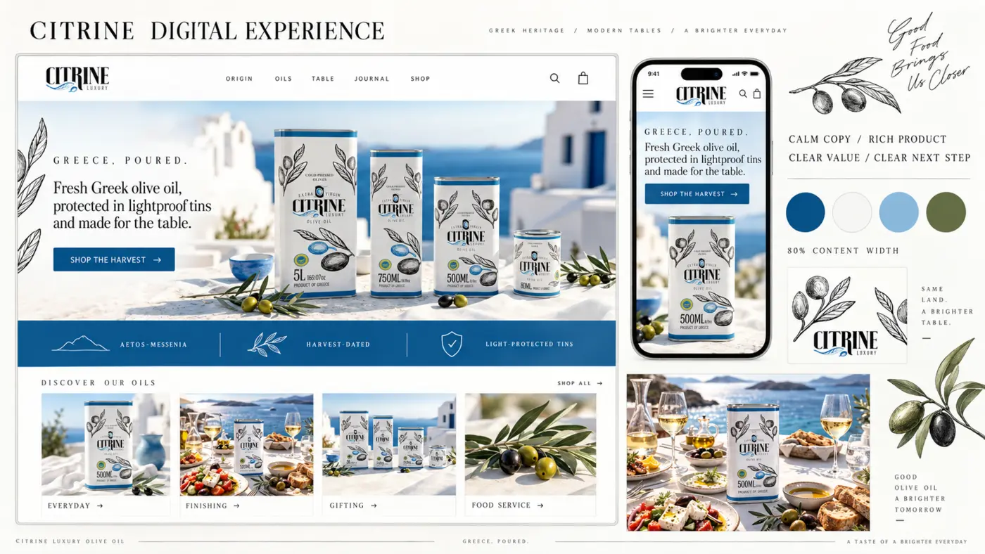
The website uses the Santorini world to earn attention, then quickly introduces provenance, formats and clear next actions. Mobile retains the product hierarchy rather than becoming a compressed desktop page.
Order journey
The route reduces the decision to three understandable moments: choose the closest format, share the destination and receive a clear confirmation.
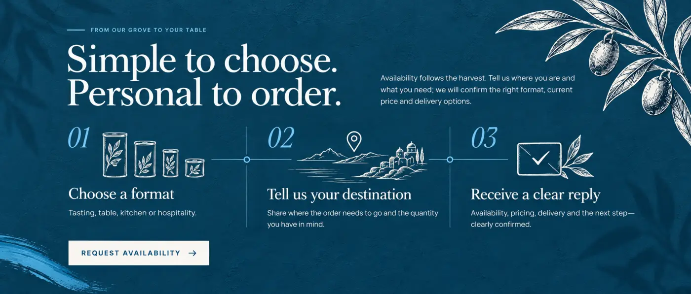
It avoids asking a first-time buyer to understand a complicated ordering system. Product comparison does the cognitive work first; the personal response then handles availability, delivery and next steps.
Asset family
Logo variations, colours, typography and material references.
Range comparison, format roles and dedicated product imagery.
Responsive web views, content modules and ordering prompts.
Why it holds together
Coherence does not come from repeating the same layout everywhere. It comes from preserving the same meaning as the medium, message and customer decision change.
Greek light, blue sea, white architecture and a clearly presented tin establish place and product immediately.
Origin, food context and format comparison explain why the product matters and which option fits.
A small number of product choices, repeated actions and a three-step ordering explanation.
Additional product pages, hospitality material, gifting campaigns and content can extend the same governed visual language.