What must remain true
The experience should feel handmade, generous and connected to real people, local work and meaningful objects.

Full visual showcase · The Soul Garden
Follow the community idea through audience routes, website hierarchy, product stories, maker profiles and responsive behaviour. Each path has its own purpose while still feeling like part of the same garden.
System snapshot
The garden idea
The central metaphor is useful as well as beautiful: makers, products, workshops and services can all grow in the same garden without becoming the same thing.
The experience should feel handmade, generous and connected to real people, local work and meaningful objects.
A crowded craft-market feeling where everything competes at once, or a polished shop that loses the maker and community story.
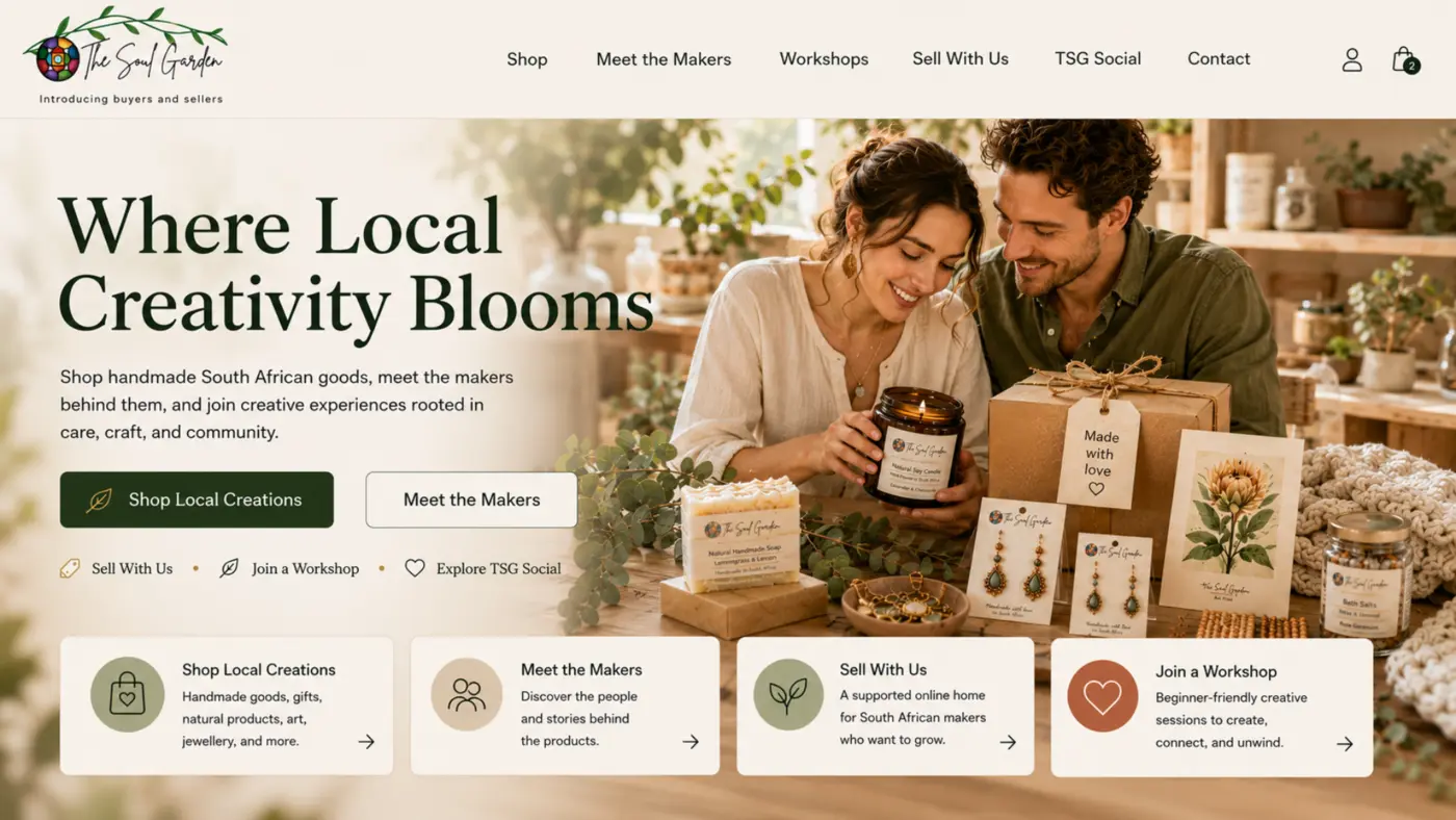
Audience doors
The most important UX decision is to reveal the main visitor intentions early. People do not need to understand the whole business before choosing the door that fits them.
Discover locally made products and understand the story behind them.
Meet the people behind the products and see how their work is represented. Makers who want to join can use the separate Sell With Us route.
Find an experience, learn something and participate in the community.
Enter the related TSG Social service without confusing it with the shop.
Explore the separate Sell With Us route for makers interested in joining the platform.
Visual world
Cream surfaces and natural green create calm. Product and maker photography carry texture and humanity. Larger editorial headings give the experience confidence, while repeated green actions preserve usability.
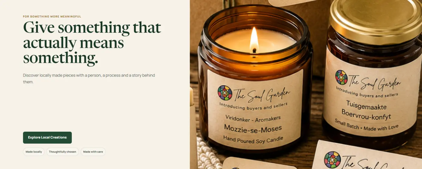
Soft natural surfaces keep the shop inviting and tactile.
Products and makers provide the detail instead of decorative clutter.
Repeated buttons and headings make each path easy to recognise.
Homepage
The opening image establishes atmosphere, then the page quickly reveals products, makers, workshops and social services. The emotional promise and the practical navigation support each other.
The breadth is part of the value. The UX task is therefore not to hide it, but to stage it: one welcome, a small number of named doors and a clear action within each section.
Shop and product
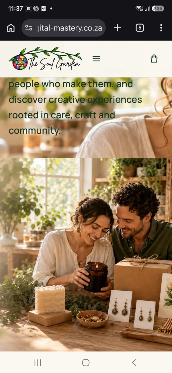
Product presentation begins with a clear image and a direct route to explore. Supporting copy can then connect the object to craft, care, gifting, ritual or the maker behind it.
Makers and community
Maker profiles prevent the catalogue from becoming anonymous. They give shoppers a reason to care, give creators visibility and reinforce the platform's local-community role.
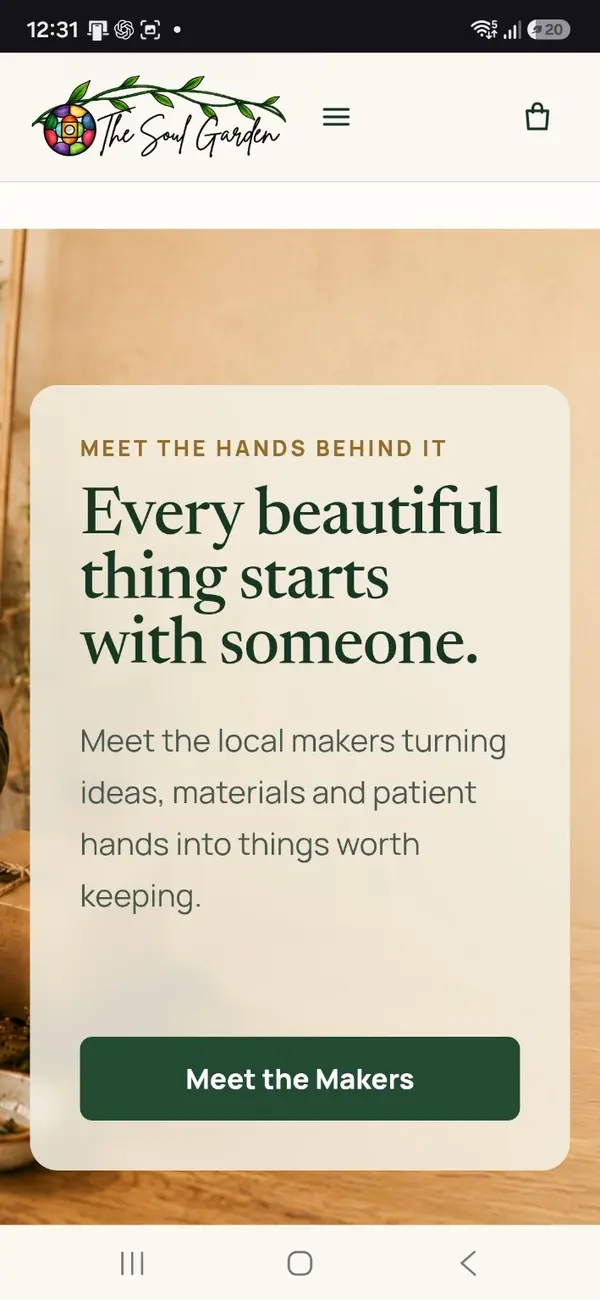
Introduce the maker, show what they create, reveal the care or method behind the work and provide a route to relevant products.
Products become connected stories rather than isolated listings, while the overall shop becomes a recognisable network of local creative work.
Mobile journeys
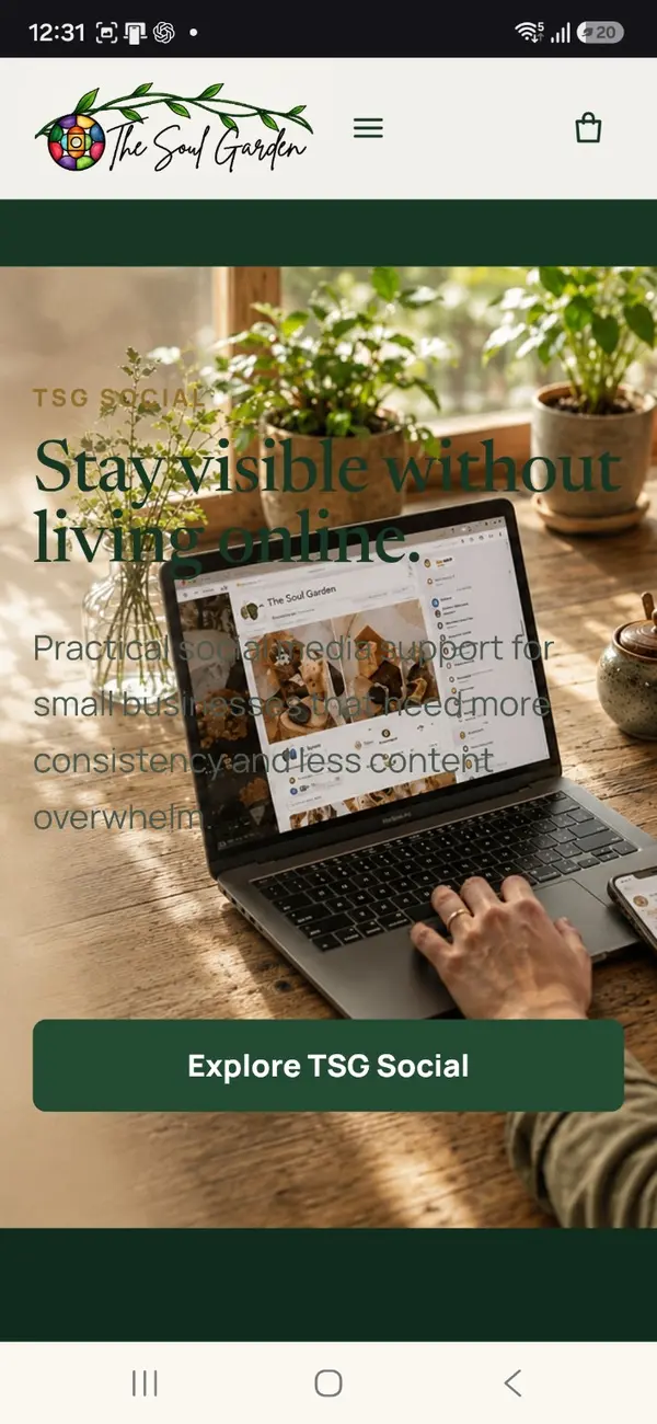
Mobile is treated as a sequence of decisions, not a shrunken desktop. The visitor sees enough context to understand the page, followed by one useful action and the next relevant section.
Why it holds together
The system can welcome new makers, products, workshops and services without becoming harder to navigate. Each addition has a known role, a relevant audience path and a repeatable visual pattern.
Natural colour, generous imagery and human stories create an immediate sense of warmth.
Visitors can choose a relevant route without decoding the entire ecosystem.
Maker and product narratives explain why each object belongs in the garden.
Future categories, profiles, events and campaigns can use the same hierarchy.